Il y a longtemps, en des temps reculés, que les moins de 18 ans ne peuvent pas connaître (disons une petite dizaine d’années), seul un bon vieux pc permettait de naviguer sur le Web. Mais depuis, tout a bien changé avec l’avènement des smartphones , tablettes, phablette, mini pc, pc portable … et bien entendu tous avec des définitions d’écran différents.
Pour rappel, la définition d’écran correspond au nombre de pixels affichés horizontalement et verticalement sur l’écran.
Ce qui veut dire que l’on dispose de plus ou moins de pixels pour afficher la même page web.
Alors comment faire rentrer une pastèque dans un melon ? Tout simplement en modifiant l’apparence du contenu ainsi que sa forme, quelques exemples :
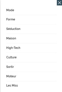
Le menu de navigation de votre meilleur compagnon :

Devient un menu qui s’affiche verticalement :
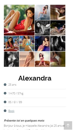
 De même la disposition des pages doit être modifiée :

Devient :
 Mais comment cela fonctionne ?
En fait sans rentrer trop dans la technique lorsque le navigateur se connecter à un site il charge des feuilles de style. En fonction de votre définition d’écran, il va utiliser tel ou tel style. Il faut donc que le site lui indique comment afficher le contenu en fonction d’un ensemble de règles. De nombreux sites sont désormais responsive et permettent désormais à accéder à de nombreux sites qui avant nécessitaient une application spécifique tel que par exemple des casinos en ligne des jeux vidéos ou des cartes intéractives. Grâce à cette façon de réaliser les sites il n’est pas obligatoire de réaliser une application spécifique pour Iphone, Android, Windows Phone même si les applications permettent souvent de gagner en performance puisqu’elles ont déjà l’ensemble des images, vidéos qui les composent. En bref le responsive a vraiment permis un accès plus simple et spécifique au contenu web en fonction de l’appareil utilisé, bon par contre cela a rajouté pas mal de boulot aux développeurs ! Si vous souhaitez d’ailleurs un beau site comme le notre n’hésitez pas à nous contacter par notre agence.